
Blinders Branding Concept
The Process
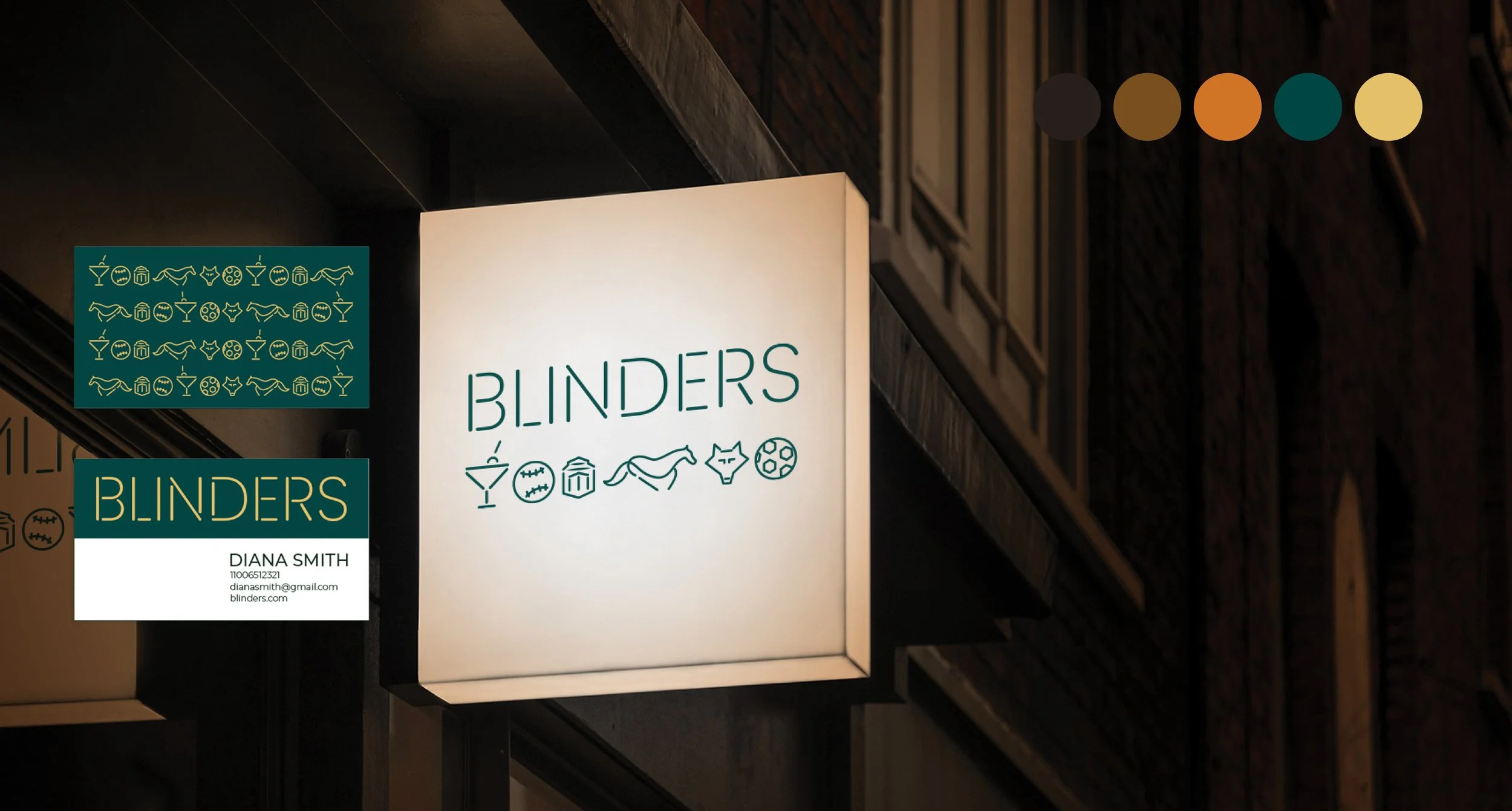
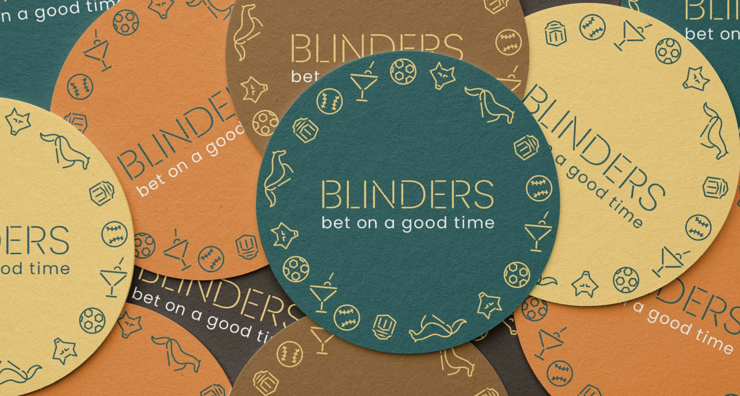
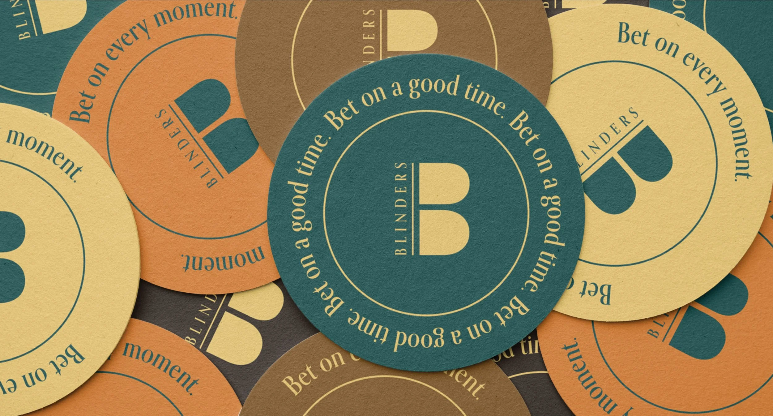
I developed two approaches centered around a forest green and gold color palette that felt timeless and classic. The first identity system centers on a custom typeface with letterforms made of individual lines that provide the flexibility to create icons or tell a secondary story when placed in different arrangements. In this system, lines and shapes give way to literal and abstract references depending on placements while remaining connected to the ‘Blinders’ wordmark.
Background
Prior to opening, a new sports lounge in the area was in need of a visual brand identity. I was tasked with developing a brand that felt sophisticated and elegant.
Responsibilities
Visual Design and Motion
Category
Brand Identity System & Strategy
Client
Concept for Blinders Sports Lounge

Concept 1
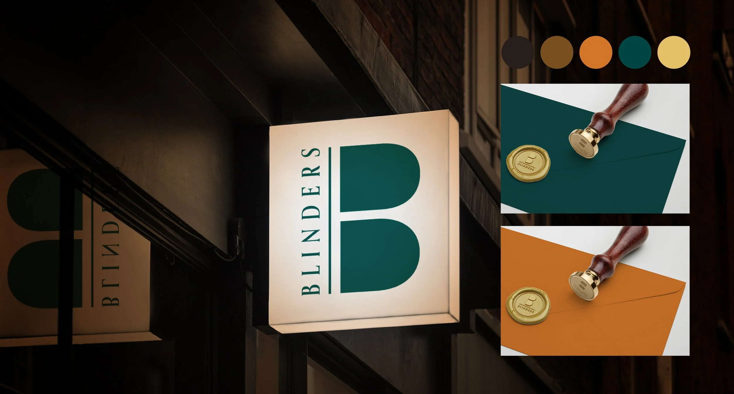
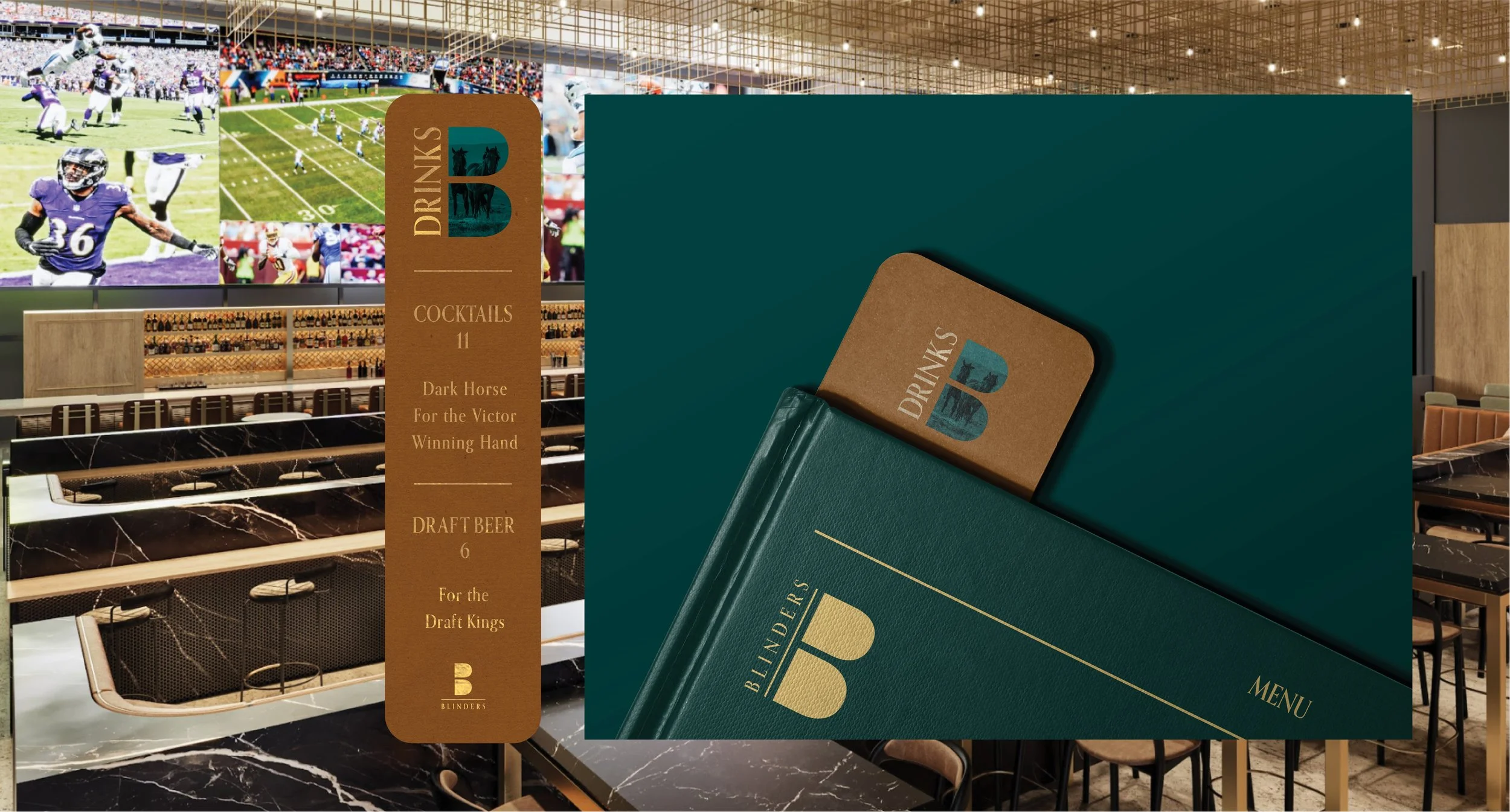
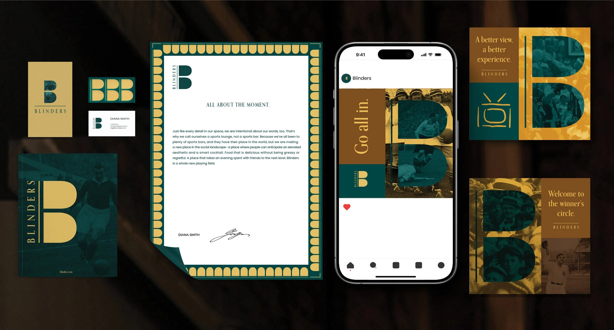
The second identity system explores shapes inside of the wordmark’s letterforms. This system carves a space to tell the story of sports in the negative space of the letters. This gives room to photographic stories that fill marks laid out to tell stories that embody the emotional experiences that people can experience in the Blinders lounge on the large screens they are known to have.
Concept 2
Contributors
Visual Design and Motion: Giselle Hernandez
Words and Taglines Provided in an Open Creative Brief