
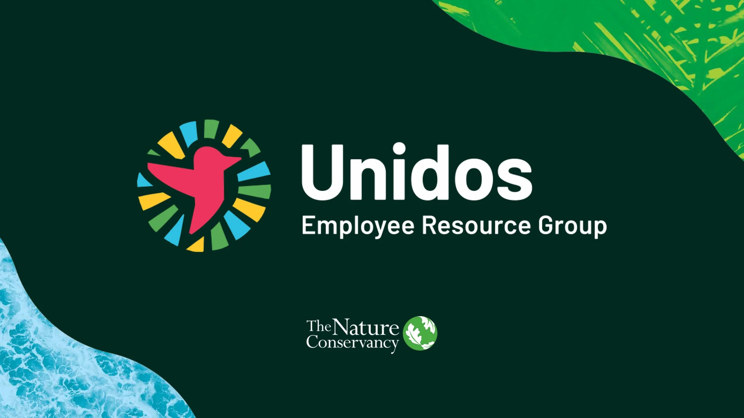
The Nature Conservancy’s UNIDOS ERG Logo Design
Responsibilities
Design, Art Direction
Category
Branding, Logo Design
Client
The Nature Conservancy
Background
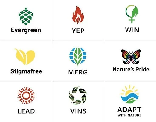
The Nature Conservancy wanted to develop a logo to represent an employee resource group (ERG) aiming to create a community for Latin America and the Caribbean within the organization that would empower and recognize employees from the region. The hope was for it to feel authentic, inclusive, and connected to the organization’s other ERG logos.

The Solution
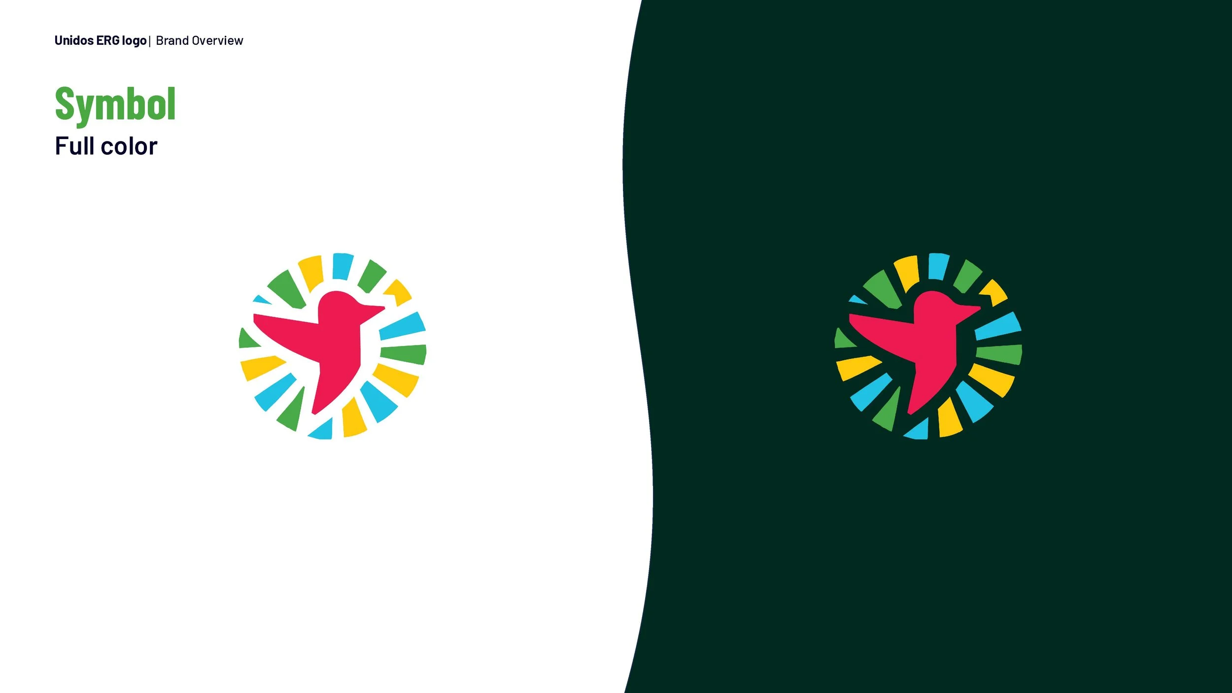
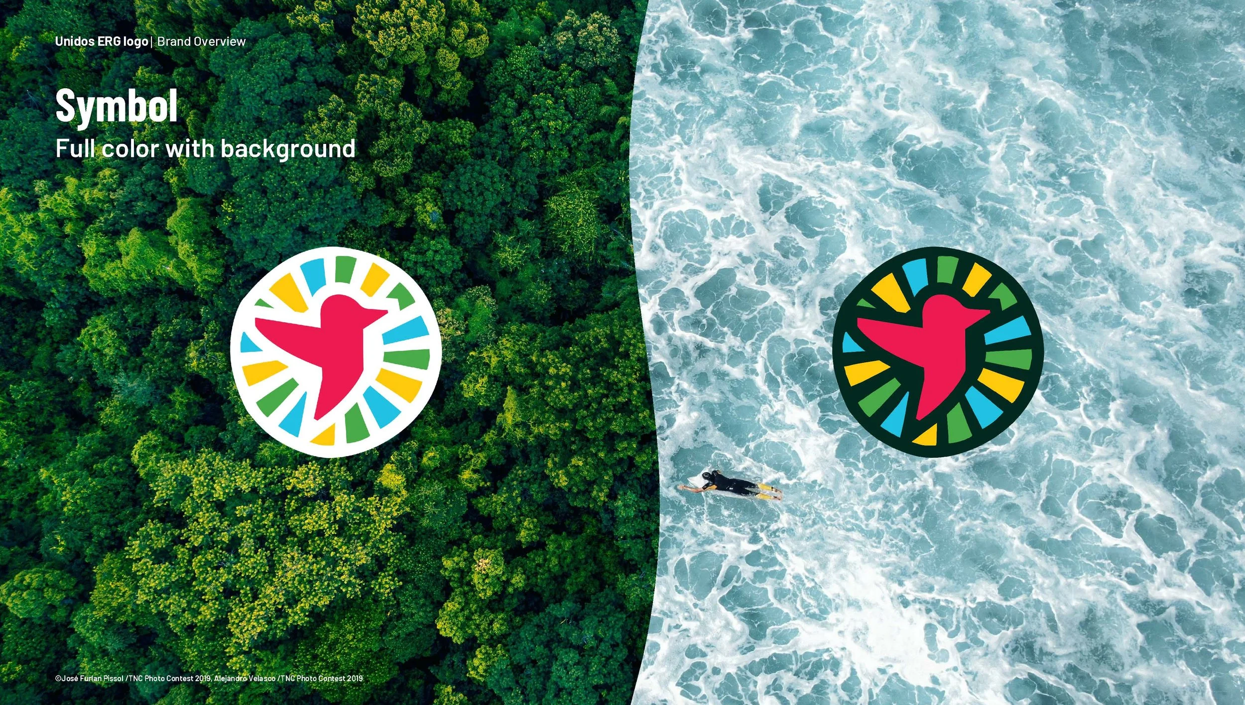
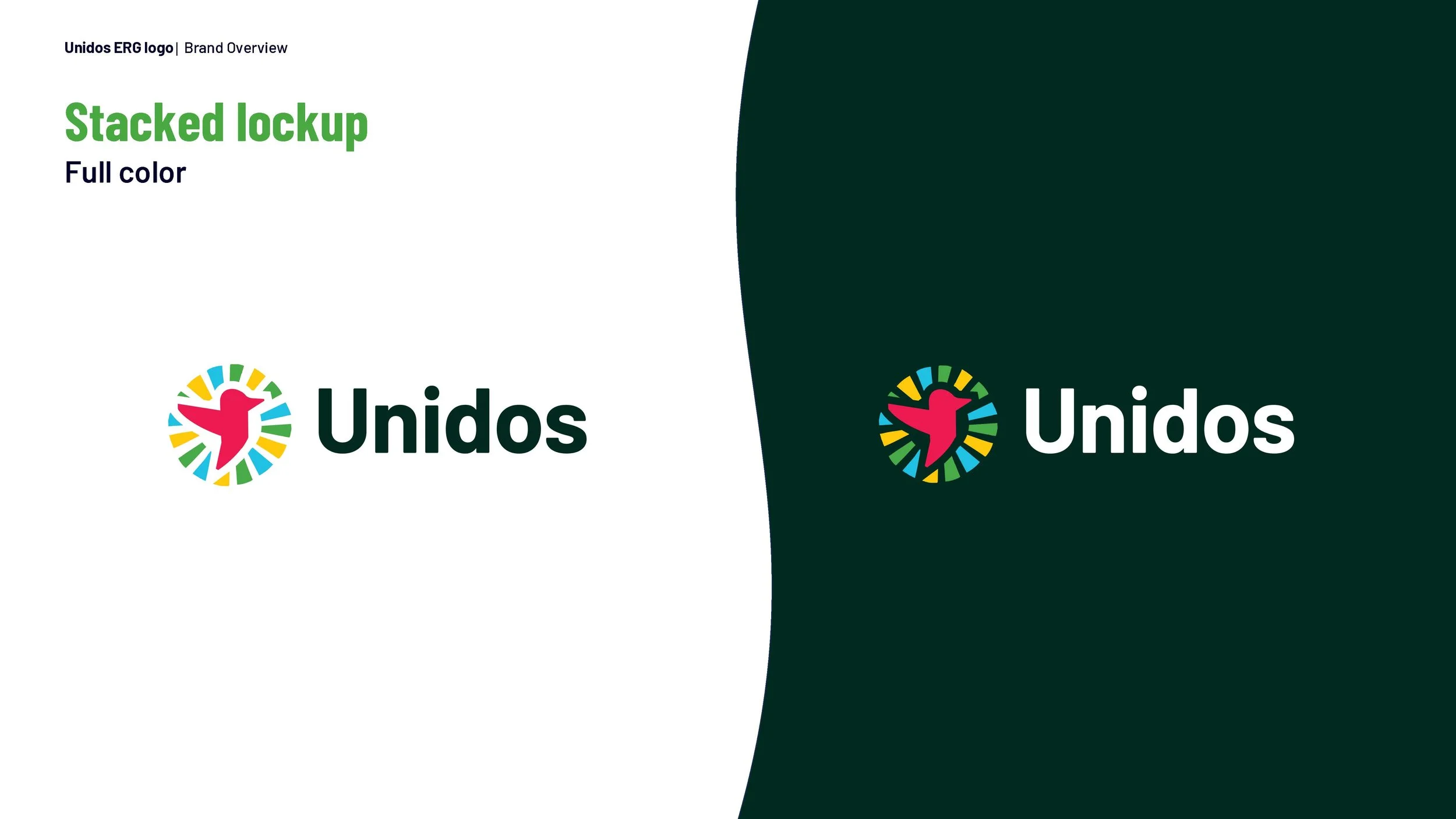
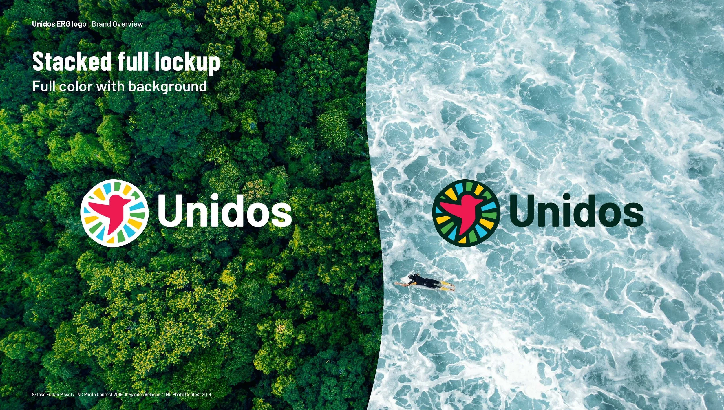
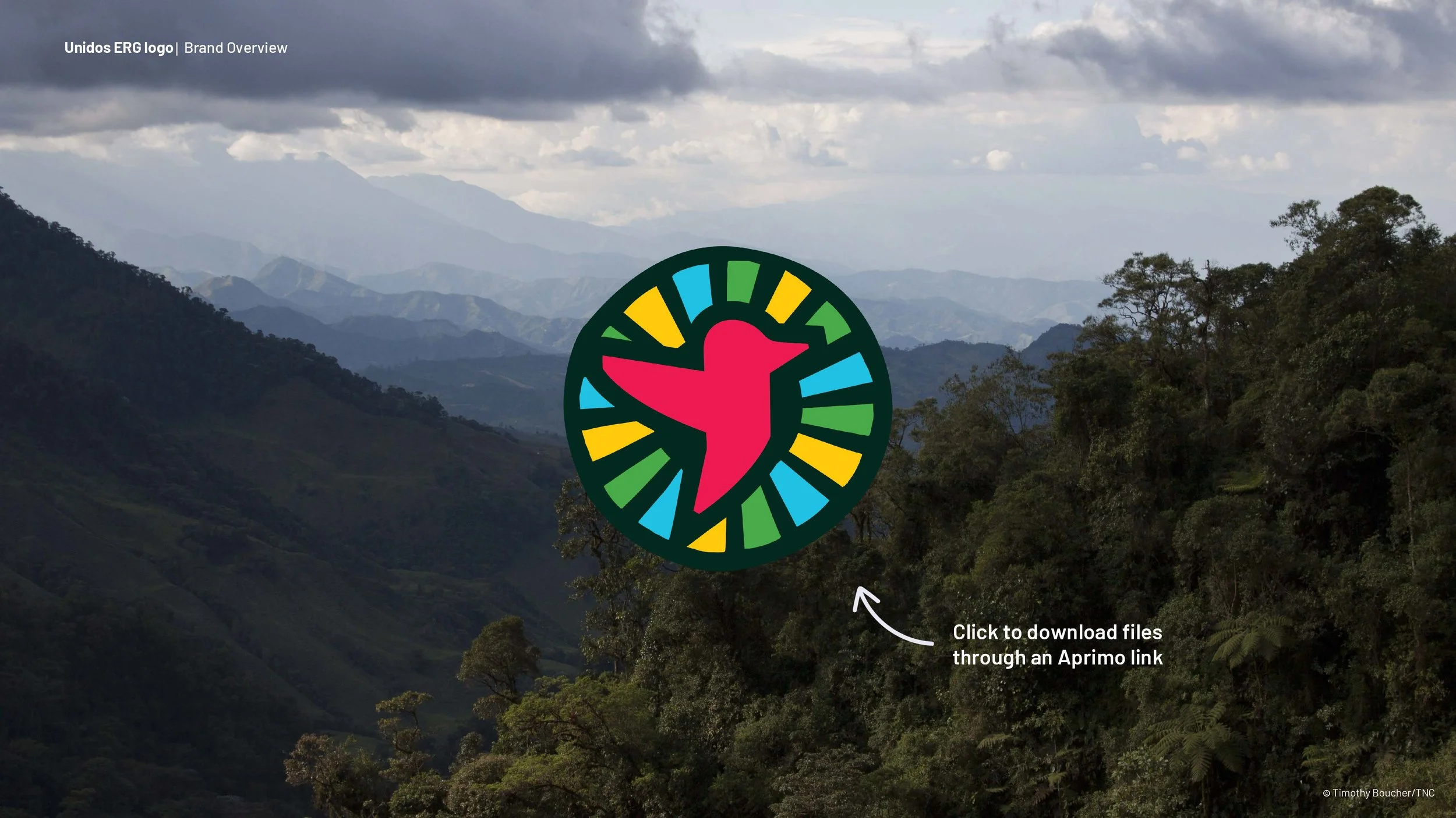
Inspired by the geometric nature of ancestral carvings, this identity mark centered a bird that became the symbol of this group as a tribute to heritage, identity, and a deep connection to nature. Like a bird’s song carried across distances, the logo symbolizes the amplification of voices around the world. Framed by rays of sunlight, the figure takes flight as a representation of shared cultural identity — one that transcends borders and unites communities. Both Spanish and Portuguese were integrated to support linguistic diversity through the name “UNIDOS” (“Together” in English) which was meant to capture the essence of unity and solidarity across borders.
Process
This branding project began with cultural research. Inspired by poetry, nature, carvings, and music found across Latin America and the Caribbean, I developed sketches and multiple concepts to explore a visual identity aligned with The Nature Conservancy's existing brand standards. Each concept reflected the employee resource groups ethos of empowerment.

Designs were refined through team collaboration, evolving into a cohesive logo system. After translating insights into a brand mark that honors cultural traditions and amplifies diverse voices, a set of guidelines was created for various uses.
Contributors
Design + Art Direction: Giselle Hernandez
Design + Art Direction: Savannah Jackson
The Nature Conservancy's Marketing Team
The Nature Conservancy's 'Unidos' Group
Brand Guidelines – 01
Brand Guidelines – 02
Brand Guidelines – 03
Brand Guidelines – 04

Brand Guidelines – 05
Brand Guidelines – 06
Brand Guidelines – 07
Brand Guidelines – 08
Brand Guidelines – 09
Brand Guidelines – 10